

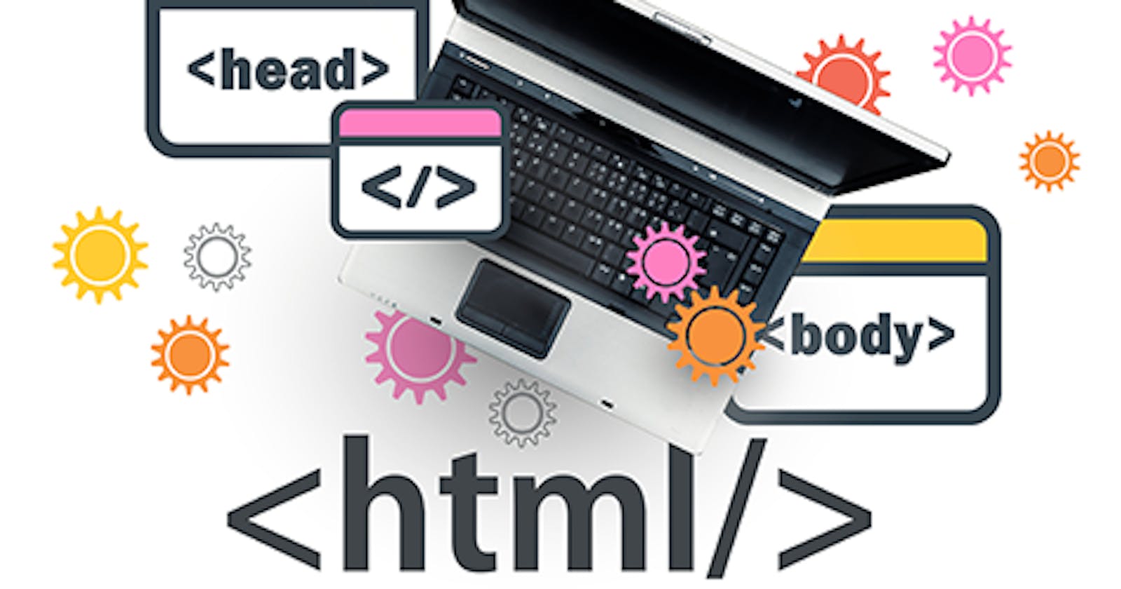
HTML5: Best Practice responsive for Media
Amazing responsive with Resolution switching and Art direction

1st Resolution switching
<img
  srcset="elva-fairy-480w.jpg 480w, elva-fairy-800w.jpg 800w"
  sizes="(max-width: 600px) 480px,
         800px"
  src="elva-fairy-800w.jpg"
  alt="Elva dressed as a fairy" />
2nd Art direction
#Image
<picture>
      <source media="(min-width:650px)" srcset="img_pink_flowers.jpg">
      <source media="(min-width:465px)" srcset="img_white_flower.jpg">
      <img src="pic_trulli.jpg" alt="Trulli" style="width:100%">
       Browser can not support
</picture>

#Video
<video width="320" height="240" controls>
  <source src="forrest_gump-1.mp4" type="video/mp4" media="(min-width:650px)">
  <source src="forrest_gump-2.mp4" type="video/mp4" media="(min-width:465px)">
</video>

#Audio same
Source
https://github.com/KhucHieuNghi/html-principle/blob/main/html-semantic/responsive-image.html